Alimento
Mobile app design project

Alimento
is a new Italian mobile app that wants to provide food easily to its users.
Mission
Delivery Food demand in the Italian scenario is growing fast, especially due to the pandemic, the coverage for online grocery shopping increased at an exponential speed. Alimento wants to become the most innovative and cool digital player.
Target


28 – 48 years old
Target

Italy
Brief & Challenge
Alimento is committed to revolutionizing e-commerce by creating a unique platform with a standout visual identity and exceptional user experience. Their goal is to set new industry benchmarks, leveraging innovative technology and intuitive design to provide unparalleled value to our customers and differentiate ourselves from competitors
Design Process
Survey results
How frequently do you go grocery shopping?
No Data Found
How do you typically get to the grocery store?
No Data Found
How much time do you typically spend at the grocery store?
No Data Found
What is your primary motivator for going to the grocery store? To buy…
No Data Found
How much do you spend on groceries per week?
No Data Found
Rate your satisfaction level with your current grocery store
4%
24%
39%
12%
4%
User interviews
Involve users in interviews.
Find early adopters…
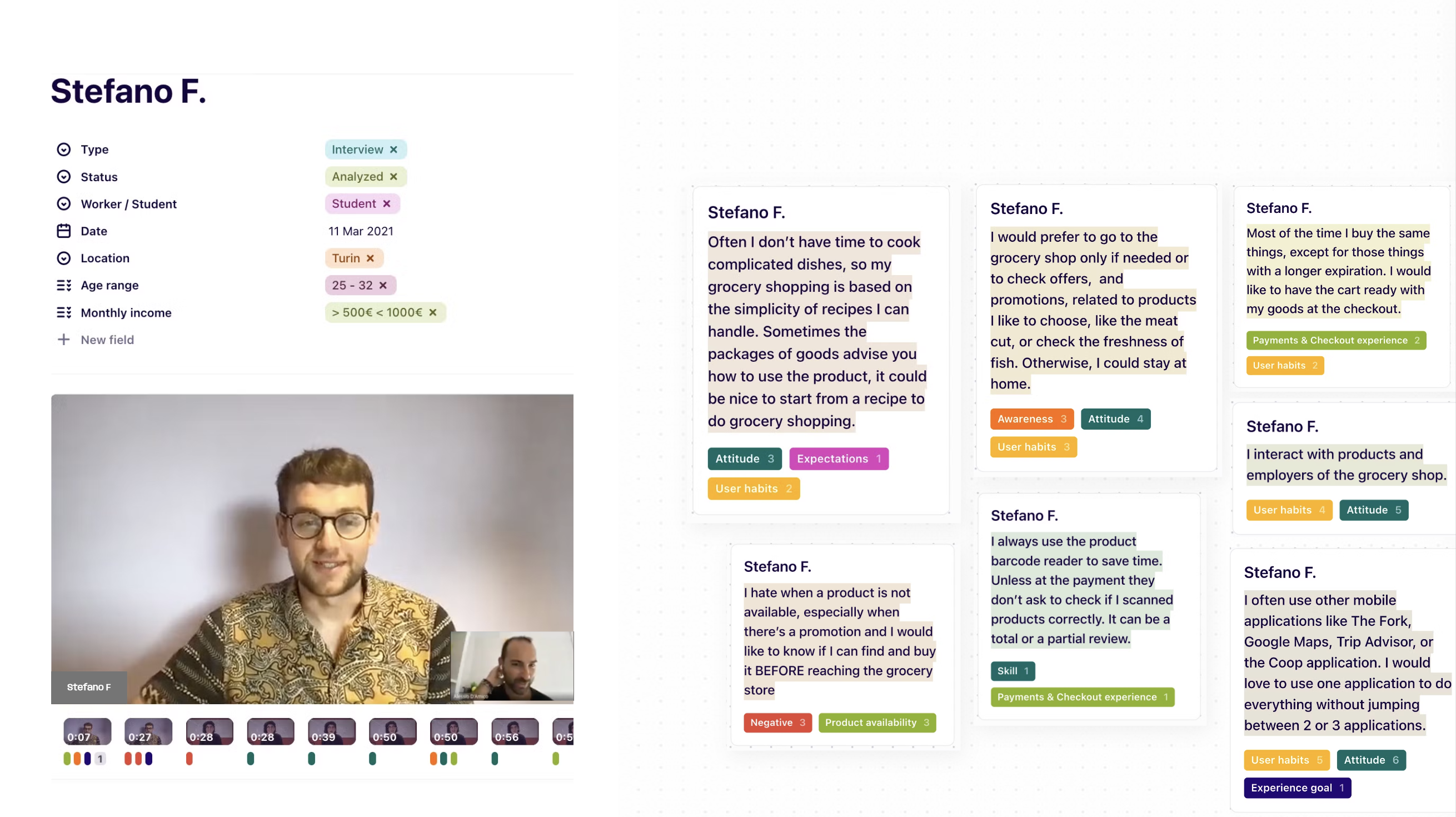
I interviewed about 20 users, trying to focus on their habits and identify a margin of improvement based on their experiences. Explaining the objective of the research I asked questions about their needs, goals, frustrations, and expectations.

User stories
1
As a busy professional, I want the food mobile app to allow me to easily add items to my cart with just a few taps, ensuring a seamless and efficient shopping experience.
3
As a frequent user of the food mobile app, I want it to remember my preferred payment and delivery options, streamlining the checkout process and making it more convenient for me to place orders quickly.
2
As a budget-conscious shopper, I want the food mobile app to clearly display any applicable promotions or discounts during checkout, helping me save money on my grocery purchases.
4
As a parent with young children, I want the food mobile app's checkout process to be quick and straightforward, cutting waiting in long queues at the grocery store and saving me valuable time.
Acceptance criteria
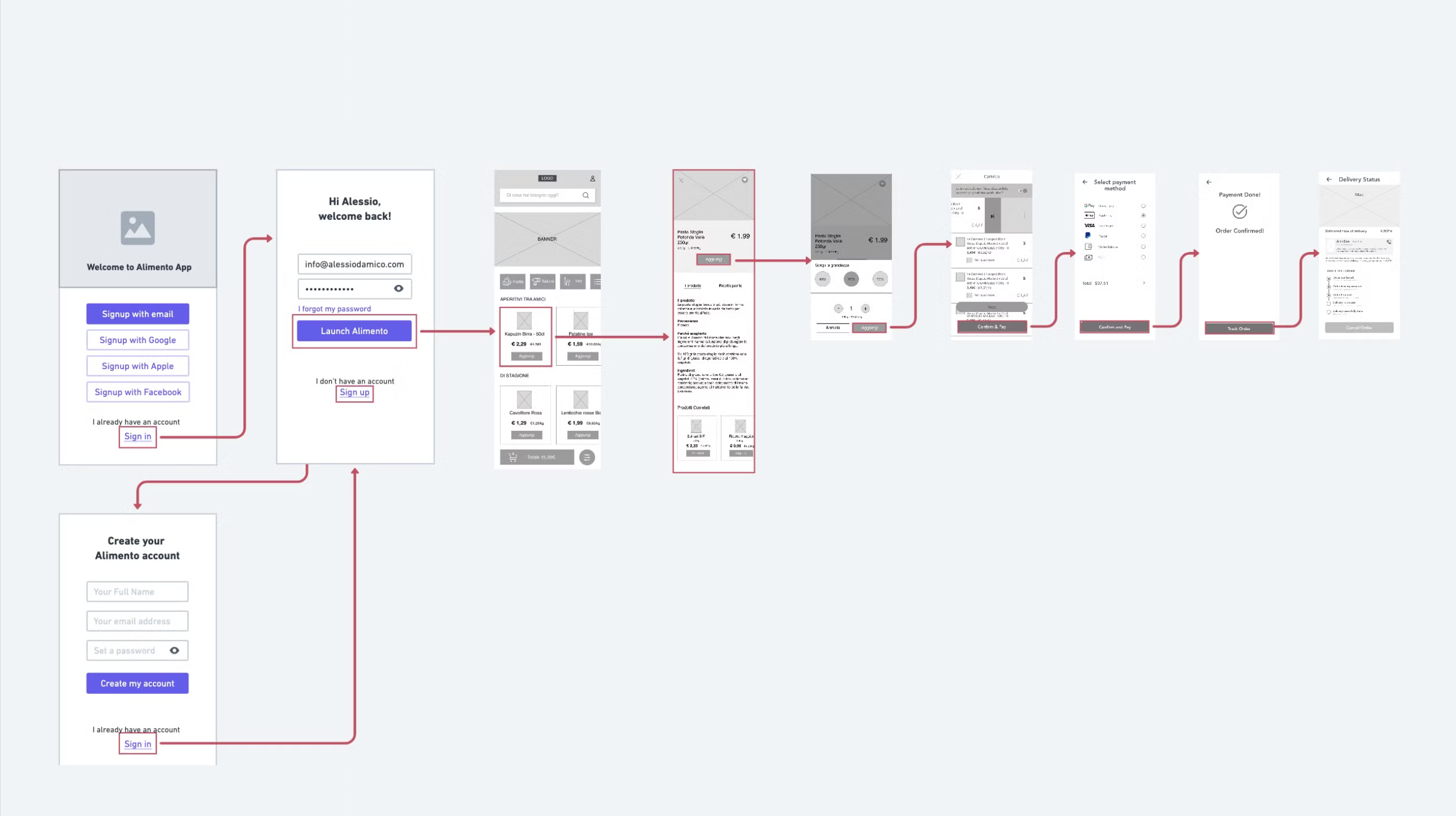
Users should be able to add items to the cart with no more than two taps from the product listing page
The app should display any applicable discounts or promotions on the checkout screen.
The app should offer free shipping on all orders, to encourage users to make purchases without additional cost considerations.
Users should have the option to save multiple payment methods and delivery addresses for quick selection during checkout
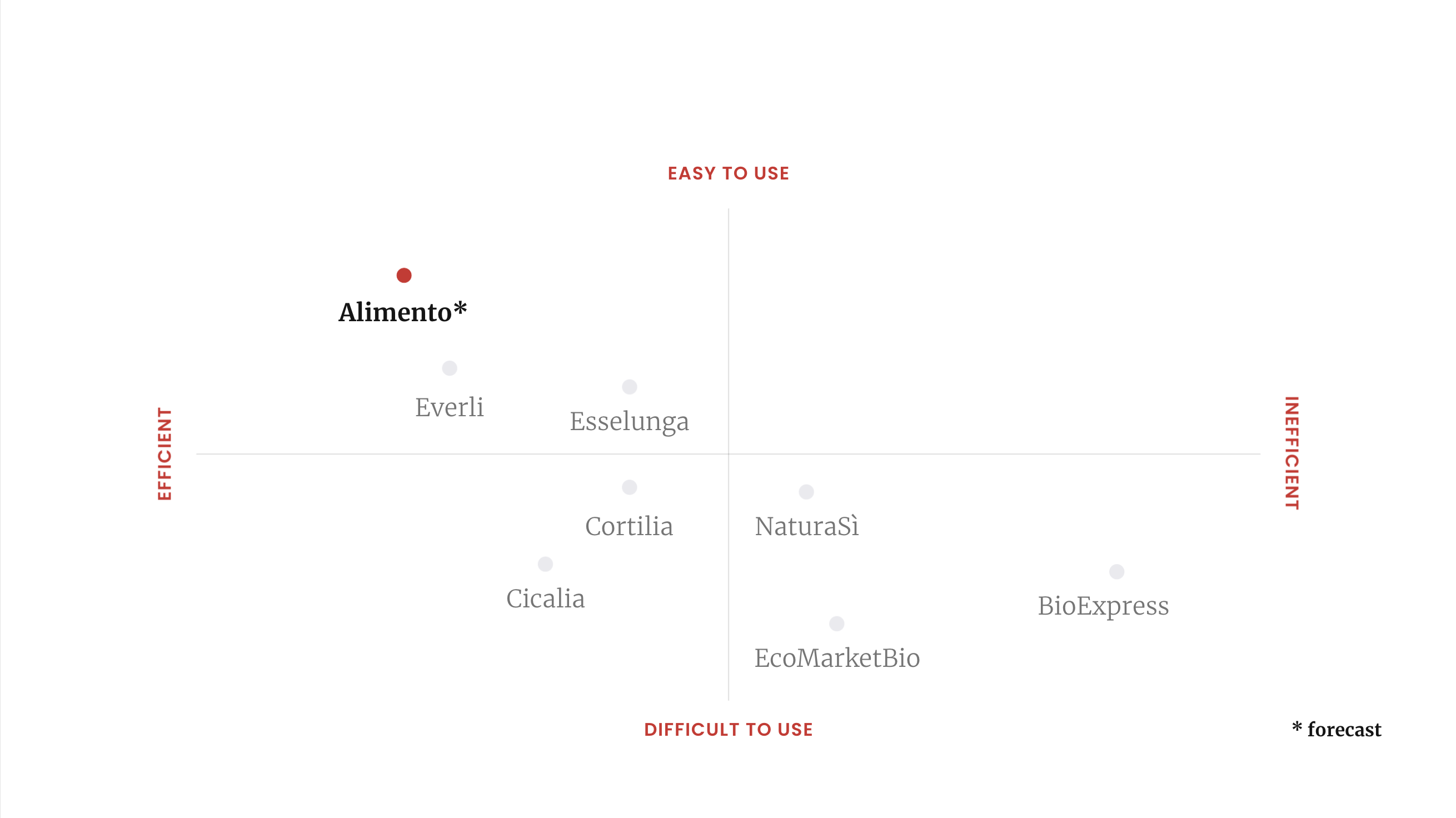
Competitor Analysis
#1 Cortilia - Spesa online
A sustainable shopping, full of artisanal and short supply chain products. Learn about the history and origin. FREE delivery as default.
#2 Everli
Online shopping in your favorite supermarkets. A personal Everli shopper chooses the products and delivers them to you from €2.99

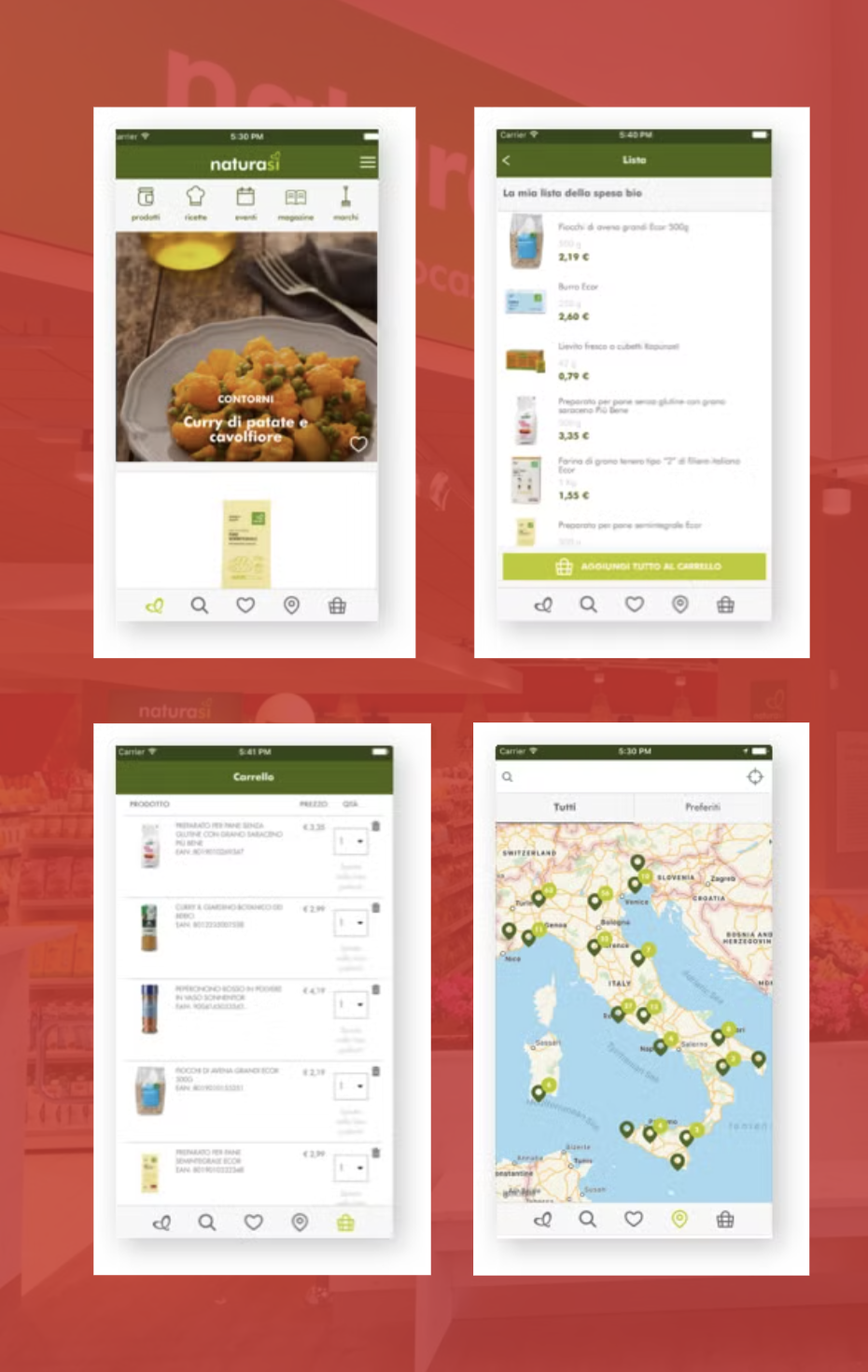
#3 NaturaSì
Deals with the wholesale and retail trade and distribution of organic, biodynamic and natural products, through a circular model

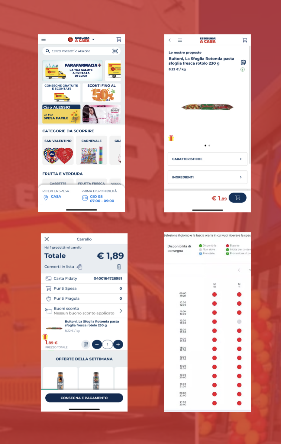
#4 Esselunga a casa
Born in Milan in 1957, Esselunga is present today in our country with over 150 stores, with the greatest concentration in Lombardy.
Competitive Landscape
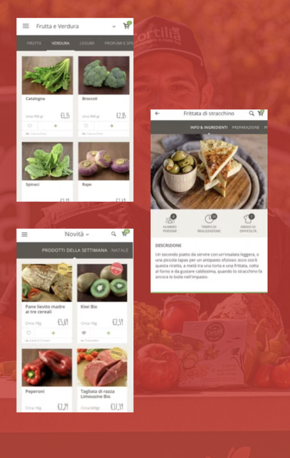
Competitor Profile: Cortilia
Overview
Cortilia seeking authentic flavors, and quality food. It brings the best local artisan products directly to your doorstep, blending the convenience of online shopping with the taste of the countryside. The app lets you explore various categories, discover weekly specials, and many others.
Loading..........
The Data is Not Available
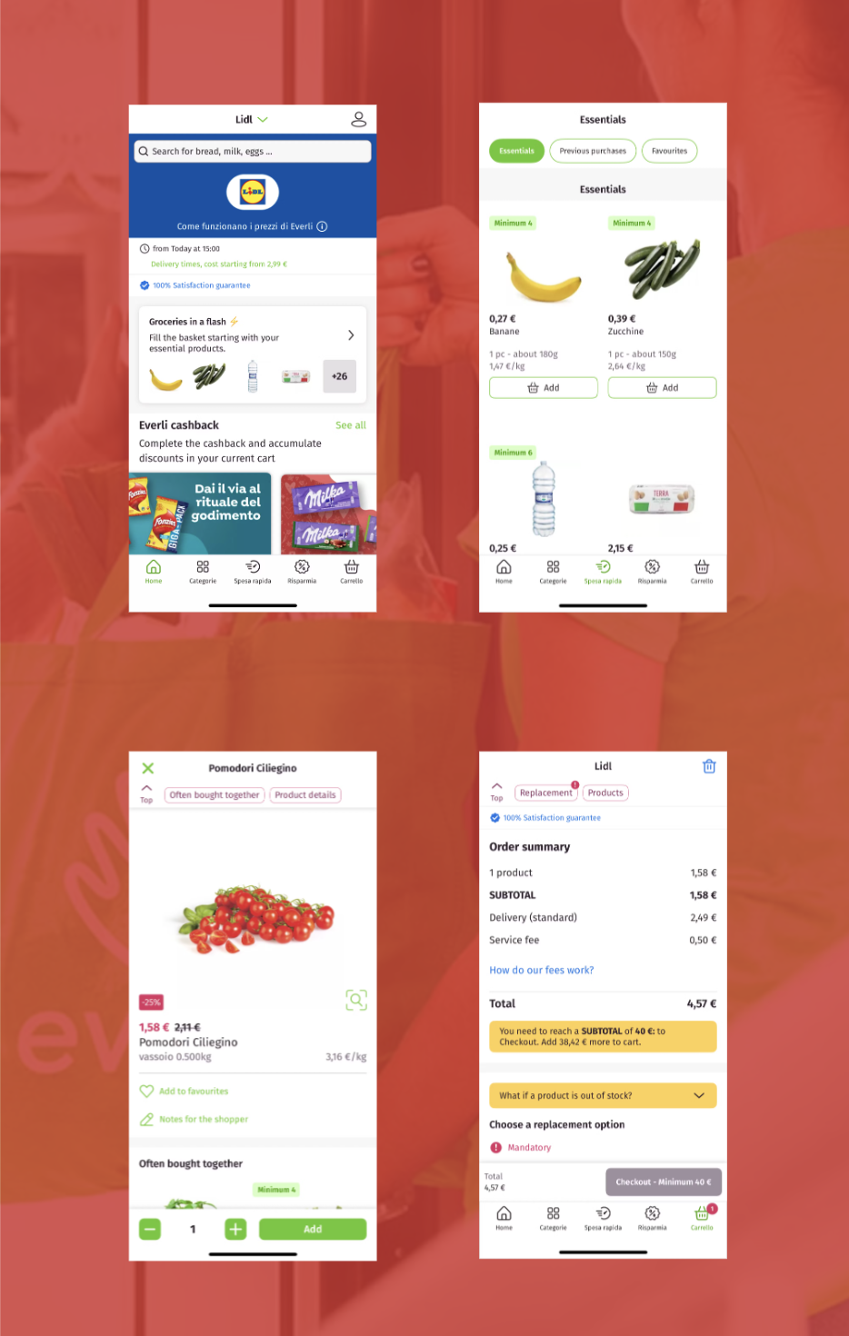
Competitor Profile: Everli
Overview
With Everli you shop online by choosing your favorite products from the best supermarkets near you. Your Shopper will be able to choose each product carefully and recognize your every need and will deliver your order on the day and time you prefer.
Loading..........
The Data is Not Available
Competitor Profile: NaturaSì
Overview
It is a product brand that includes over 400 organic products, cereals, legumes, seeds, dried fruit, but also derivatives, and fresh products. It combines taste, high quality, environmental protection, and sustainability for future generations.
Loading..........
The Data is Not Available
Competitor Profile: Esselunga a casa
Overview
Order your shopping via the web and choose when it is most convenient for you to have it delivered by our yellow “click the tomato” van or when to collect it at our Click and Go locations.
Loading..........
The Data is Not Available
The Product

Personas
Giulia
Giulia is a busy Italian professional in her mid-thirties who loves cooking and is always trying out new recipes. She values healthy and high-quality ingredients but finds it challenging to find time to shop for groceries amidst her hectic schedule. She is frustrated with the inconvenience of crowded supermarkets and long checkout lines.

🤯 Problem
Our Persona struggles from this issue
Giulia struggles with finding time to go grocery shopping amidst her busy schedule.
🎯 Goal
Our Persona wants to achieve this transformation
Giulia wants to simplify her grocery shopping experience and regain more time for other activities. She is looking for a convenient solution that allows her to order groceries online and have them delivered to her doorstep.
🔔 Trigger
This event pushed our Persona to find a solution
After a particularly stressful day at work, Giulia found herself rushing to the supermarket only to spend an additional hour in line at the checkout.This experience made her realize that she needed a more time-efficient solution for her grocery shopping.
🤦♂️ Pains
And especially these negative consequences
- Wasting time navigating through crowded supermarkets
- Waiting in long checkout lines
- Feeling stressed and overwhelmed with her weekly grocery shopping
🤩 Benefits
So they can experience these positive consequences
- Save time by avoiding crowded supermarkets
- Convenient home delivery of groceries
- Reduce stress and enjoy a more relaxed grocery shopping experience
🛑 Barriers
But these doubts slow our Persona down
- Concerns about the freshness and quality of online groceries
- Lack of familiarity with online grocery shopping platforms
- Resistance to change her traditional grocery shopping habits
Marco
Marco is a busy Italian man in his early thirties who leads a hectic lifestyle.He struggles with the time-consuming process of grocery shopping and is actively looking for a solution that can help him save time and simplify this task.
🤯 Problem
Our Persona struggles from this issue
Marco finds grocery shopping to be a time-consuming and tiresome chore.He is frustrated with the long queues, crowded supermarkets, and wasted time spent searching for items on his list.
🎯 Goal
Our Persona wants to achieve this transformation
Marco's main goal is to significantly reduce the time and effort spent on grocery shopping.He wants a convenient and efficient solution that allows him to order groceries online and have them delivered to his doorstep, saving him valuable time and energy.
🔔 Trigger
This event pushed our Persona to find a solution
The last straw for Marco was when he had to spend over an hour in a long queue at the supermarket after a tiring day at work. This frustrating experience made him realize that he needed to find a better way to shop for groceries.
🤦♂️ Pains
And especially these negative consequences
Wasting valuable time in long queues at the supermarket
Feeling overwhelmed by crowded and disorganized supermarkets
Struggling to find specific items on his grocery list
🤩 Benefits
So they can experience these positive consequences
Convenient and time-saving online grocery shopping experience
Elimination of long queues and crowded supermarkets from Marco's life
Effortless and efficient grocery list management
🛑 Barriers
But these doubts slow our Persona down
- Concerns about the freshness and quality of online groceries• Doubts about the reliability and punctuality of delivery services• Resistance to change his traditional grocery shopping habits
Mockups
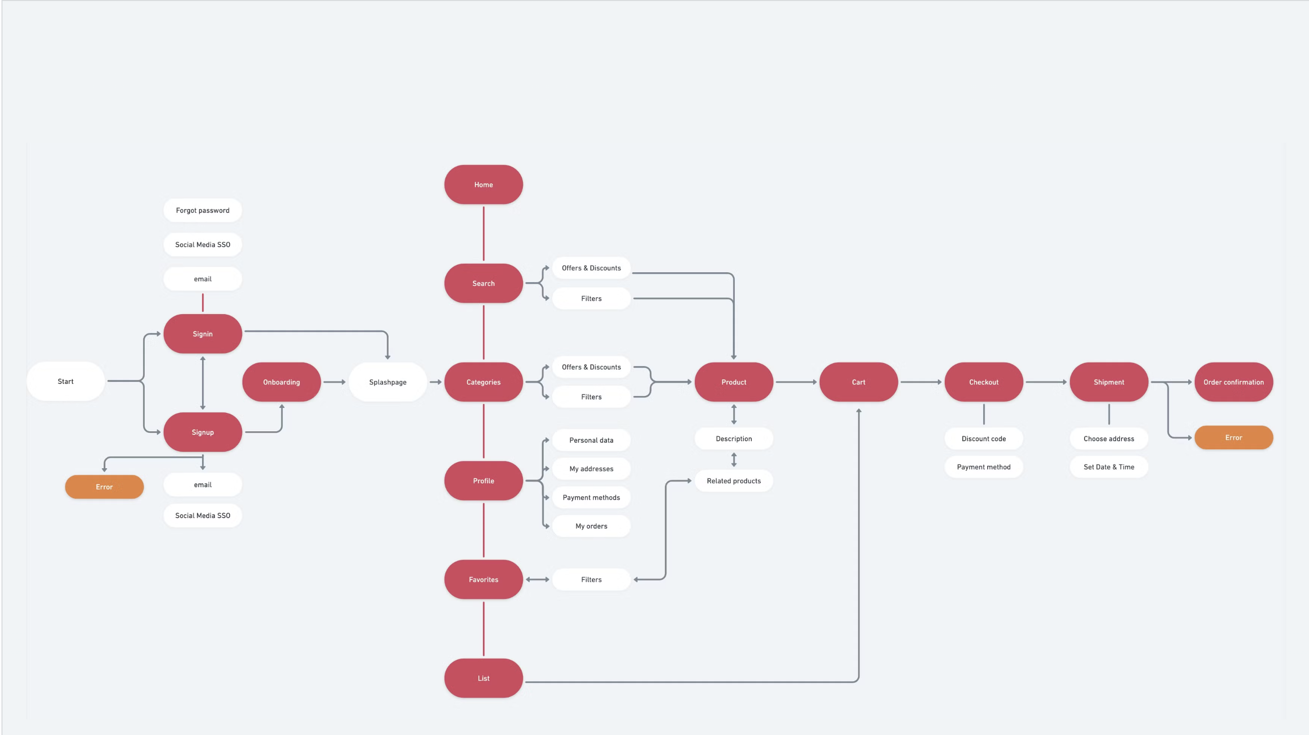
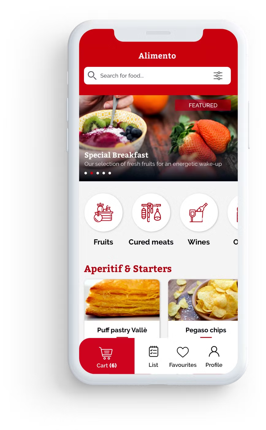
Components: NAVbar
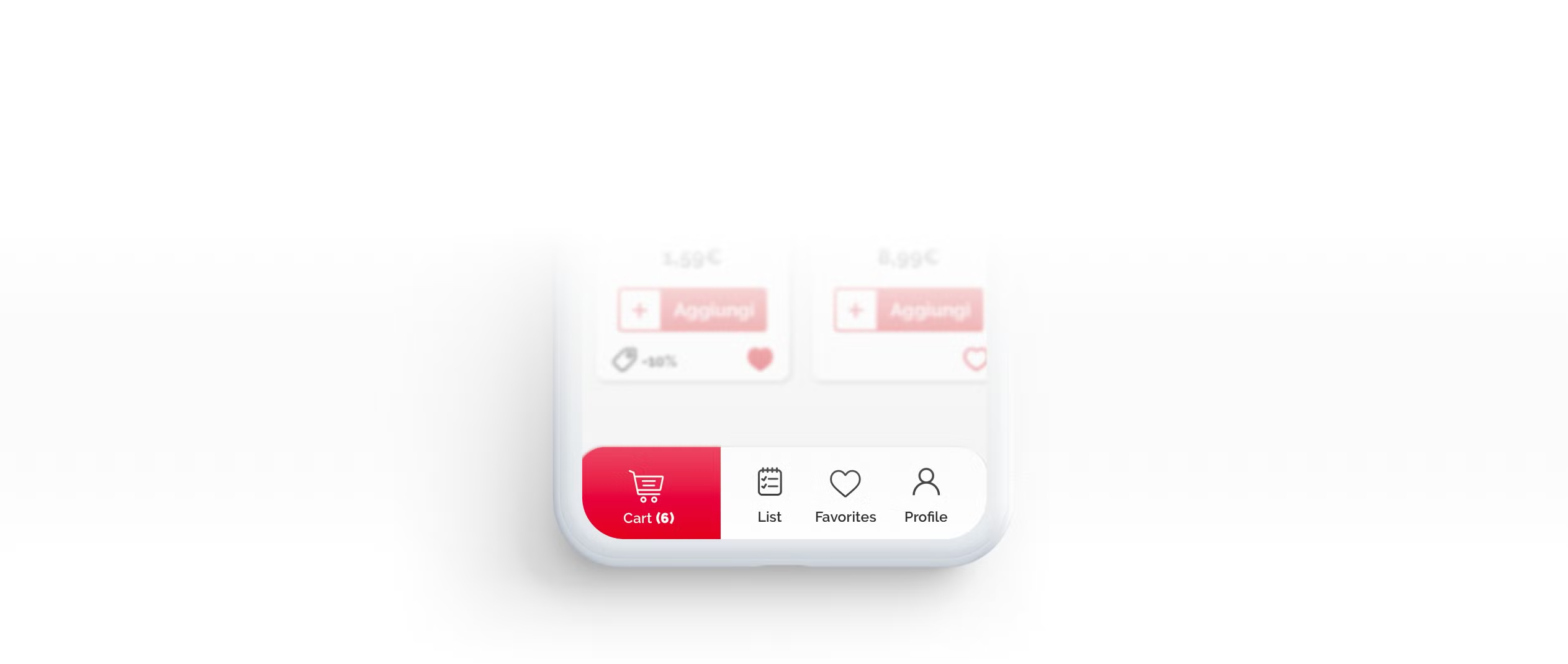
Cart
Cart section with a current number of items
Wishlist
Possibility to add items on a list or write notes
Favorite items
Your favorite products always accessible
Profile
Account section with settings and history of previous orders
Components: NAVbar
Categories
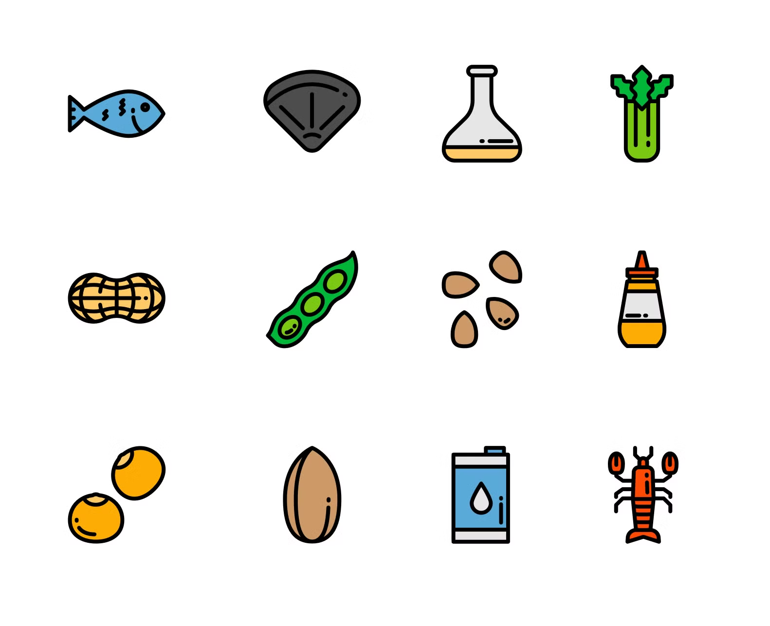
allergens
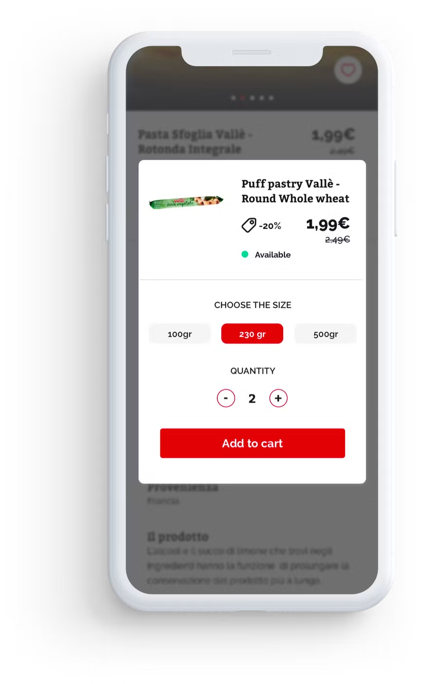
Select product size or weight
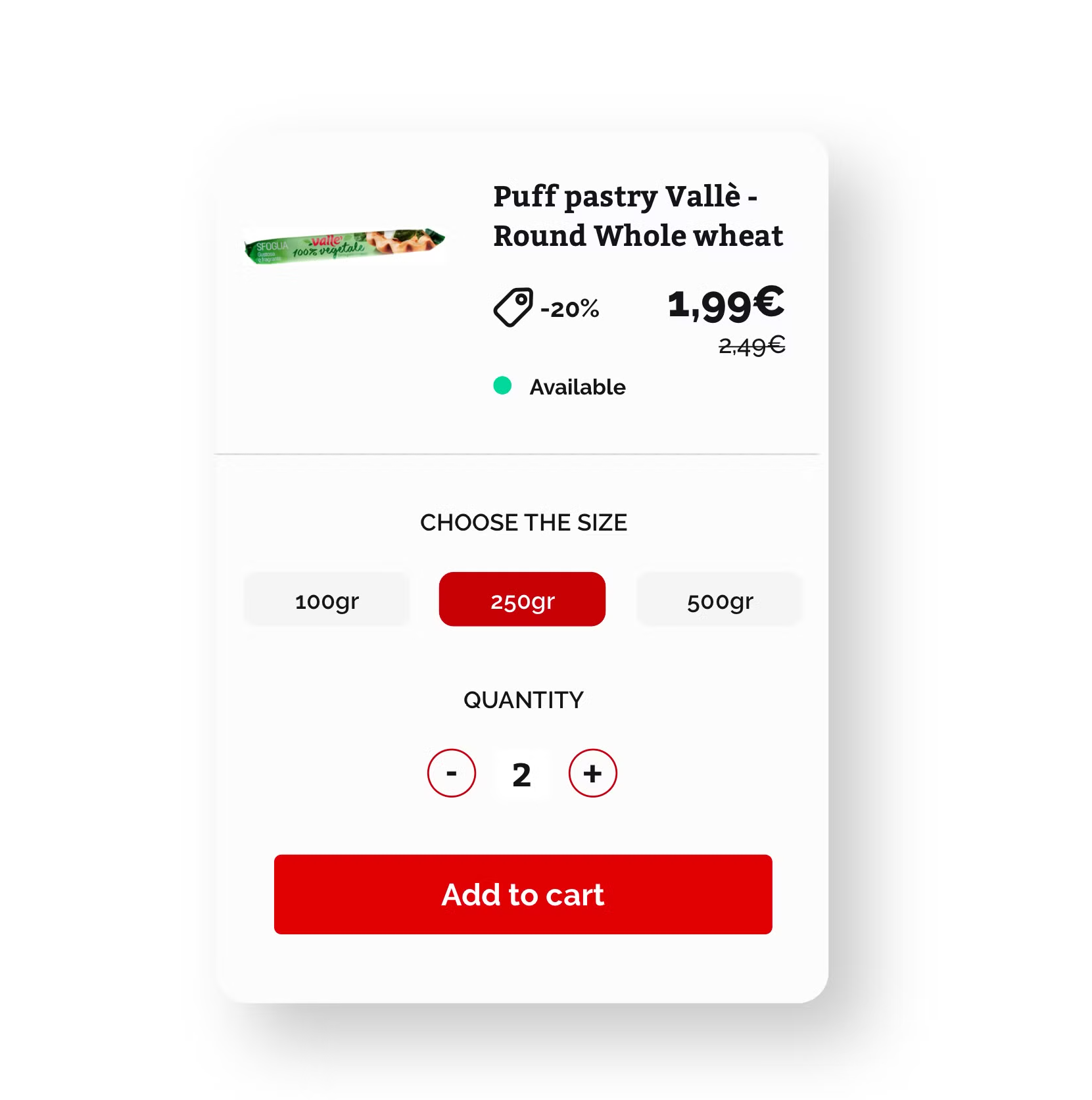
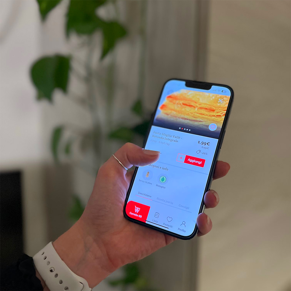
Product description, price, discount, availability
Select quantity: add or remove items
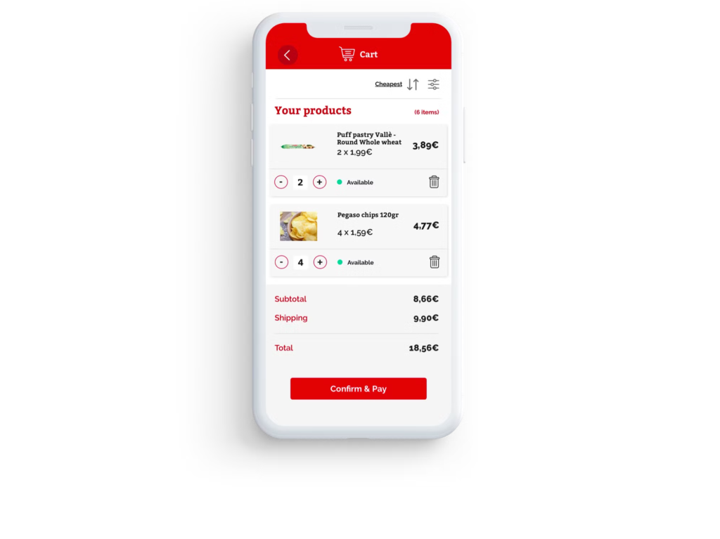
Details about selected products, with quick accessibility to change the items' quantity, or delete them.
Summary of user's cart. Check the total amount and head to the checkout and payment step
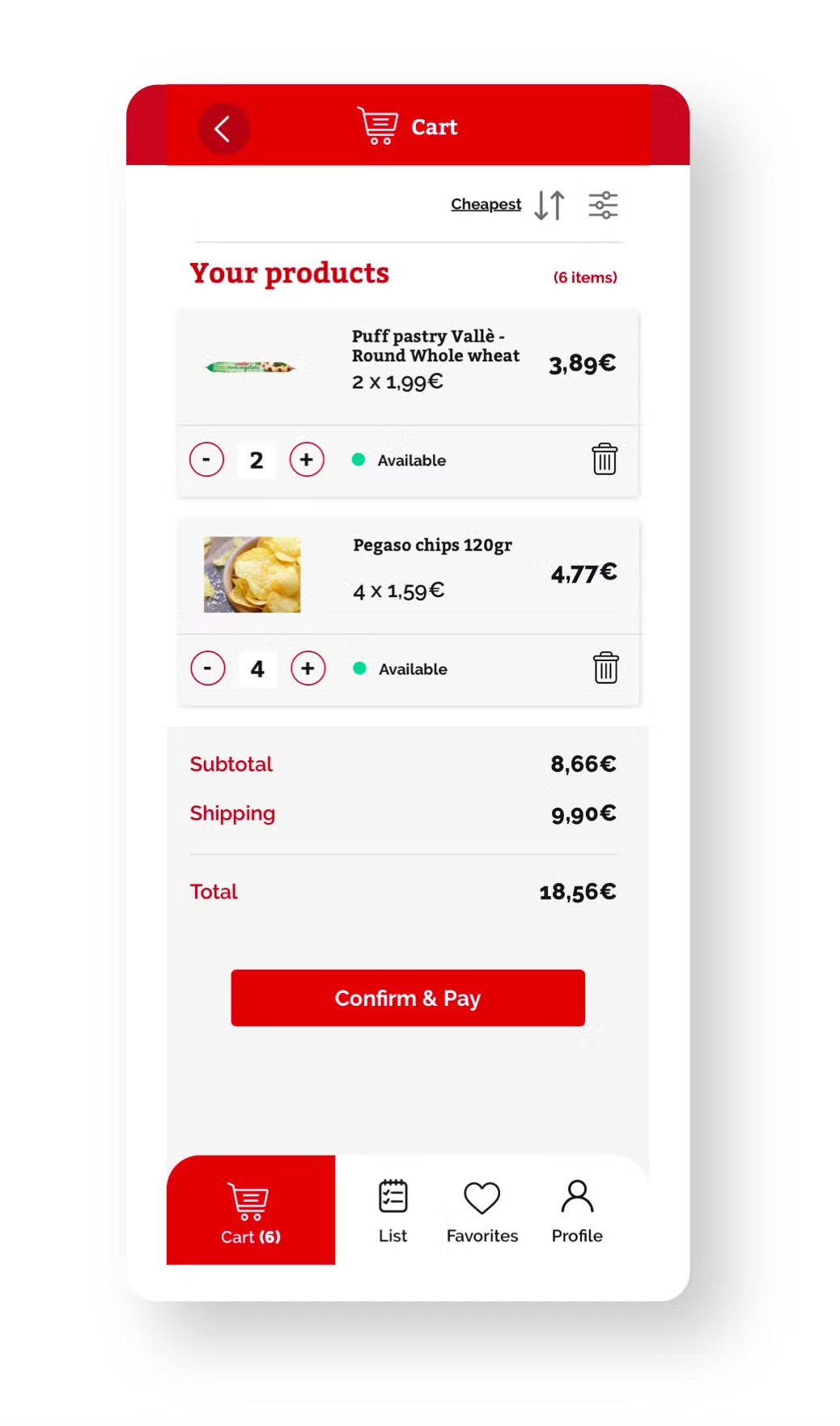
Sorting options and the possibility to suggest alternative products if some are not available.

User testing
Ease of Navigation:
- 90% of users (14) found the navigation within the app to be intuitive and easy to use.
- Positive feedback was received regarding the clear categorization of products and the simplicity of switching between different sections.
- All users got how to add items to their cart.
Customization Features:
- Some users suggested adding more options for customization to further enhance the personalization aspect of the app.
Product Discovery:
A few users expressed difficulty in locating specific products and suggested implementing a more robust search feature.
Some users have cleary understood how to tap to filter or sort results.
Checkout Process:
85% of users reported a smooth and hassle-free checkout experience.
Desired metrics to measure after the GTM
Page views per session
Behavioral
Drop-off rate
Behavioral
Sessions
Diagnostic
Time on task
Behavioral
Exit tate
Behavioral
Conversion Rate (CR)
Behavioral
Conclusions
Final thoughts
Alimento presented an exciting opportunity to elevate the online grocery shopping experience to new heights.
Although the project never came to fruition, the thorough analysis, insightful examination of users’ behavior, and extensive research conducted provided invaluable insights.
The work invested in research, analysis, and design process on this project underscored its significance in shaping the future of online grocery shopping
